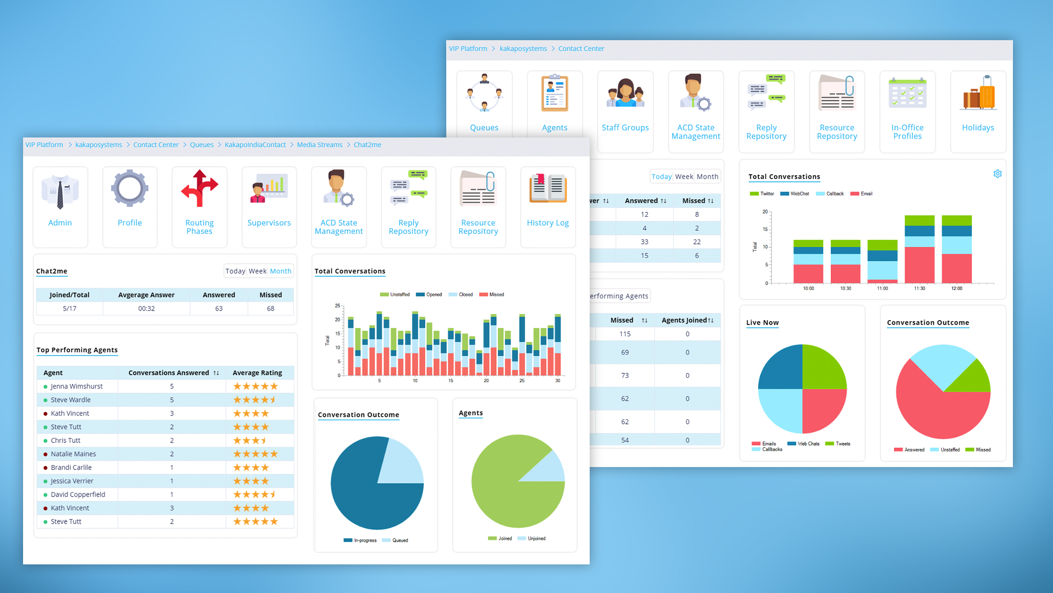
The new Portal Management Dashboard is essential for providing real-time visibility of conditions across the Contact Center. Users can view current and historical behaviour and compare data for a more in-depth analysis.
What’s Happening Right Now?
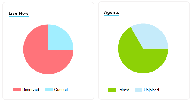
Pie charts allows user to easily compare and act on the number of conversations queuing with the number of Agents joined and unjoined to help reduce waiting times.
Compare by Hour, Day and Month

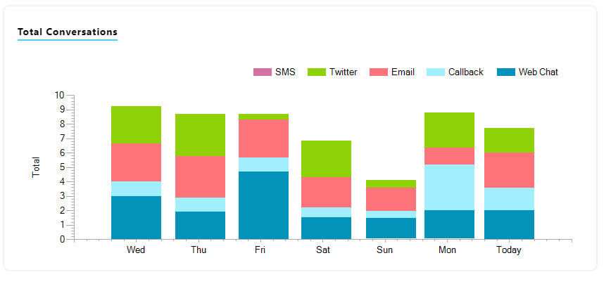
The bar chart breaks down the data making it easier to establish how best to manage the Contact Center. E.g. If Friday is the busiest day for Web Chats but the quietest for Tweets, users can distribute their Agents accordingly.
Deeper Insight

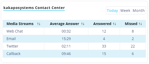
Delve deeper into each Queue and Media Stream to ascertain their performance and find any isolated issues.
Agent Distribution

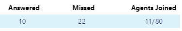
More missed conversations than answered? How many Agents are actually joined and taking conversations? Determine where more Agents are needed and assign them accordingly to improve overall customer service.
Conversation Outcome

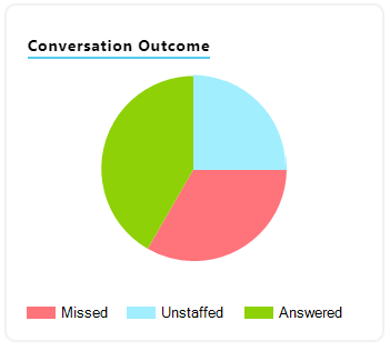
Conversation Outcome identifies what’s happening to conversations that aren’t being answered, are they being missed or unstaffed?
By comparing the data for all Queues and Media Streams by the day, week and month, the new Portal Management Dashboards equip admin users with the tools they need to understand how to intelligently manage the Contact Center.